Writing task one: pie charts
You will be given one or more pie charts. You task is to describe the information given in the graph by writing a 150 word report. You are not asked to give your opinion. You should spend around 20 minutes on the task.
What is being tested is your ability to:
Sample task
You should spend about 20 minutes on this task.
Write a report for a university lecturer describing the information in the graphs below.
Summarise the information by selecting and reporting the main features, and make comparisons where relevant.
Write at least 150 words.


Your task
Complete the task one report writing exercise above. Spend only 20 minutes. Then look at the guidelines and the sample answer below.
Guidelines for a good answer
Does the report have a suitable structure?
Does the report use suitable grammar and vocabulary?
Does the report meet the requirements of the task?
Now read sample answer one. How well does it follow the guidelines?
Sample answer
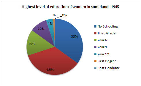
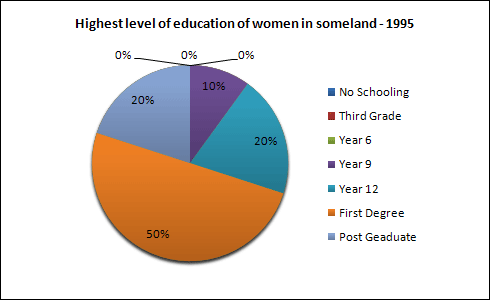
The pie charts compare the highest level of education achieved by women in Someland across two years, 1945 and 1995. It can be clearly seen that women received a much higher level of education in Someland in 1995 than they did in 1945.
In 1945 only 30% of women completed their secondary education and 1% went on to a first degree. No women had completed post-graduate studies. This situation had changed radically by 1995. In 1995, 90% of women in Someland had completed secondary education and of those, half had graduated from an initial degree and 20% had gone on to postgraduate studies. At the other end of the scale we can see that by 1995 all girls were completing lower secondary, although 10% ended their schooling at this point. This is in stark contrast with 1945 when only 30% of girls completed primary school, 35% had no schooling at all and 35% only completed the third grade.
In conclusion, we can see that in the 50 years from 1945 to 1995 there have been huge positive developments to the education levels of women in Someland.
Teacher's comments on the sample answer
“The report structure is clear and well organised with an introduction, body and conclusion. The candidate uses a variety of grammatical structures and vocabulary so that the writing is not repetitive. In terms of task requirements, the report meets the word limit. Although the candidate has not included every figure presented in the charts, the answer does accurately reflect the content of the graphic material and gives a strong impression of the trend of change in the education of women which is the main point of the comparison of those particular charts. The sample answer above is therefore a very good one.”
Strategies for improving your IELTS score
Selecting information
In completing this task, it is important that you fully describe all of the graphic information given. However, this does not mean that you should note every detail. In most cases there will be too much information for you to mention each figure. You will therefore need to summarise the graph in meaningful segments. In other words, you will describe the significant trends in your report.
Report structure
As in the line graphs task, your report should be structured simply with an introduction, body and conclusion. Tenses should be used appropriately.
Use two standard opening sentences to introduce the graph or graphs and your report. These opening sentences should make up the first paragraph. Sentence one should define what the graph is about, that is the date, location, what is being described in the graphs etc. For example:
The pie charts compare the highest level of education achieved by women in Someland across two years, 1945 and 1995.
Notice that in the single line graph we said that ‘the graph shows' but with two charts we can more accurately say ‘the pie charts compare’.
Note the tense used. Even though it describes information from the past, the graph shows the information in the present time.
Notice that the sample opening sentence does not simply copy the words used on the graphic material. Copied sentences will not be assessed by the examiner and so you waste your time including them.
Sentence two (and possibly three) might sum up the overall trend. For example:
It can be clearly seen that women received a much higher level of education in Someland in 1995 than they did in 1945.
Notice the Simple Past tense is used. Here we are talking about what happened in the past.
The body of the report will describe the chart or charts in detail. You will need to decide on the most clear and logical order to present the material. In this case it might be best to work through the charts one by one.
Ideally your report should end with one or two sentences which summarise your report or draw a relevant conclusion.
Grammar and vocabulary
You will receive a higher mark if your writing uses a range of structures and vocabulary correctly rather than a limited number.
Pie charts generally show figures in percentages and your language in writing the report should reflect this. You will talk about ‘the percentage of graduates’ or the ‘proportion of people who completed secondary school’.
Make sure that you are confident with comparatives and superlatives used to compare and contrast and the language used to describe pie charts.
Comparing and contrasting
One syllable
Adjectives with one syllable form their comparatives and superlatives like this:
| Positive | Comparative | Superlative |
|---|---|---|
| cheap | cheaper | cheapest |
| large | larger | largest |
| bright | brighter | brightest |
| Exceptions: | ||
| good | better | best |
| bad | worse | worst |
Two syllables
Some adjectives with two syllables form their comparatives and superlatives like this:
| Positive | Comparative | Superlative |
|---|---|---|
| pretty | prettier | prettiest |
| happy | happier | happiest |
| But many form their comparatives and superlatives like this: | ||
| striking | more striking | most striking |
| Although some can form their comparatives and superlatives like this: | ||
| common | more common | most common |
| clever | more clever / cleverest | most clever / cleverest |
Three or more syllables
All adjectives with three or more syllables form their comparatives and superlatives like this:
| Positive | Comparative | Superlative |
|---|---|---|
| attractive | more attractive | most attractive |
| profitable | more profitable | most profitable |
| expensive | more expensive | most expensive |
Exercise
What are the comparative and superlative forms of these adjectives:
| Positive | Comparative | Superlative |
|---|---|---|
| accurate | ||
| useful | ||
| convenient | ||
| correct | ||
| dangerous | ||
| happy | ||
| likely | ||
| modern | ||
| new | ||
| possible | ||
| probable |
Describing one part of the chart
Starting with the adjective:
|
The highest
The greatest
The lowest
The most
A significant
The smallest
The largest
|
percentage of
proportion of
number of
|
women
cars sold
holiday makers
|
are employed in the X category
are red
come from Spain
|
Starting with the subject:
|
Red is the
Professional is the
Spain is the
|
most
second/third most
least
|
popular
prevalent
common
|
car colour
employment category
holiday destination
|
Describing two parts of the chart
Starting with the adjective:
|
As many
Twice as many
Three times as many
Not as many
|
red cars
women
holiday makers
|
are sold
are employed in X
come from X
|
as... |
|
More
Far more
Much more
Many more
A lot more
Substantially more
Considerably more
Significantly more
Slightly more
Fractionally more
|
than |
Starting with the adjective:
|
Blue cars are
Women are
Spain is
|
as
quite as
just as
nearly as
almost as
not as
|
common
popular
prevalent
|
as... |
|
more
much more
far more
substantially more
considerably more
slightly more
fractionally more
less
much less
far less
considerably less
fractionally less
|
women
cars sold
holiday makers
|
than |