IELTS Writing Task 1 #126
Writing Exam Tip
When you first see a bar chart, ask yourself the following questions:
1) What do the numbers on the vertical/horizontal axis
measures?
2) How is the information grouped on the other axis?
3) What do the different shades of the bars show?
4) When was the data collected?
The answers will give you the essential information for understanding it.
Make sure you know which units are being used to measure quantities.
You should spend about 20 minutes on this task.
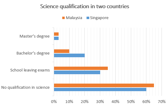
The chart below gives information about science qualifications held by people in two countries.
Summarise the information by selecting and reporting the main features, and make comparisons where relevant.
Write at least 150 words.

Model answer
The bar chart illustrates the percentage of people who hold a science qualification in Singapore and Malaysia. A prominent feature is that a significantly low percentage of people hold science qualifications, that is Master’s and Bachelor’s degrees in science from university level studies in both countries. Less than 5% of people hold a qualification in science at Master’s degree level in both Singapore and Malaysia.
There is a significant difference in the percentage of people holding science qualifications at Bachelor level between the two countries; while this number is 20% in Singapore, in Malaysia it is a mere 10%. The percentage of people with school leaving exams in science is slightly higher in Malaysia than in Singapore. 35% of people in Malaysia have a science qualification at this level, whereas the number in Singapore is 5% lower. Finally, more than half the people in both countries hold no science qualification at all.
(152 words)