Academic Writing Sample Task 1 #43
You should spend about 20 minutes on this task.
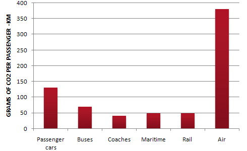
The Bar Chart shows CO2 emissions for different forms of transport in
the European Union.
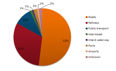
The Pie Chart shows the percentage of European Union funds being spent on
different forms of transport.
You should write at least 150 words.
Give reasons for your answer and include any relevant examples from your own
knowledge or experience.


model answer:
The chart shows CO2 emissions per passenger kilometre for variuos methods of
transport in the European Union while the pie chart shows European Union
spending on transport. Flying by air produces by far the greatest CO2 emissions,
approximately three times as much as passenger cars which are the next largest
producers. Very little is spent by the EU on air travel while roads make up more
than half of the EU transport budget.
Trains produce about three times less CO2 emissions per passenger kilometre than
passenger cars and eight times less than air travel. Nearly a third of EU
transport funds are spent on railways.
Ships are a clean form of transport and produce about the same amount of CO2 per
passenger kilometre as trains do. However, only 2 percent of EU funds are spent
on ports. A further one percent is spent on inland waterways.
Coaches are the cleanest form of transport. Emissions of CO2 per passenger
kilometre from coaches are half those of buses. Buses emit less than half as
much CO2 per passenger kilometre as cars. The European Union spends 10 percent
of its transport budget on public transport, such as buses and coaches.
(197 words)