IELTS Writing Task 1 #180
Interpreting data
You should spend about 20 minutes on this task.
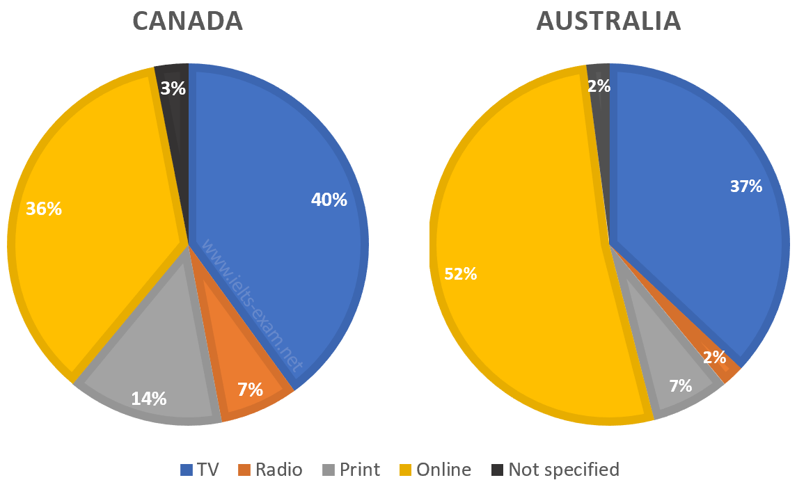
The pie charts compare ways of accessing the news in Canada and Australia.
Summarise the information by selecting and reporting the main features, and make comparisons where relevant.
Write at least 150 words.

Model answer
The pie charts show the principle ways of finding out the news in two different countries, Canada and Australia. The two nations show broadly similar patterns, though there are some differences, both significant and minor.
One of the most prominent features of this data is that, while in Canada over a third of people access the news online, in Australia the figure is more than half, at 52%. It is apparent that viewing the TV news is popular in both countries, with about two fifths of Canadian population favouring this mode of delivery and only 3% fewer in Australia. One major difference between Canada and Australia is that over twice as many people read the news in print in the former, compared with the latter. The figures are 14% and 7% respectively. Similarly, listening to the news on the radio is preferred by three times more people in Canada than in Australia.
Overall, it can be said that the high levels of internet use in Australia mean that other methods such as radio and print are used less in comparison with Canada.
(182 words)