IELTS Writing Task 1 #178
IELTS Writing Task 1 Tip
When describing the data in pie charts, use a variety of ways to describe the numbers, for example, use a mixture of percentages and fractions, to show the range of your language. Use modifiers, such as almost, just over and approximately if the figures are not exact fractions.
You should spend about 20 minutes on this task.
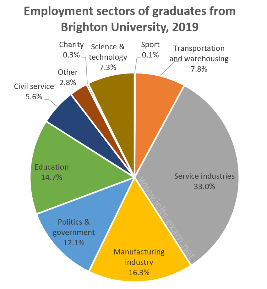
The chart below shows the proportions of graduates from Brighton University in 2019 entering different employment sectors.
Summarise the information by selecting and reporting the main features, and make comparisons where relevant.
Write at least 150 words.

Model answer
The pie chart illustrates the career choices of Brighton University's 2019 graduates, giving the percentages who worked in each of various sectors after finishing university. Overwhelmingly, industry and government were the most popular choices.
Just under half the students went into industry, with service industries attracting more Brighton graduates than any other sector by far — almost a third (33.0%). About half that number (16.3%) took jobs in manufacturing.
Politics and public service were the next most popular choice, accounting for nearly a fifth of graduates. Just over 12% went into politics and a further 5.6% chose the civil service. The other significant career choices were education (about 15%) and two others: transportation and warehousing, with 7.8%; and science and technology with 7.3%.
The least popular choices included work in the charitable sector and careers in sport, both of which were chosen by well under 1% of graduates. Finally, 2.8% entered work in other, unspecified, sectors.
(155 words)