IELTS Writing Task 1 #157
Identifying and comparing data on a chart
Some texts include statistics and data in graphical form. To understand this information, first identify:
You should spend about 20 minutes on this task.
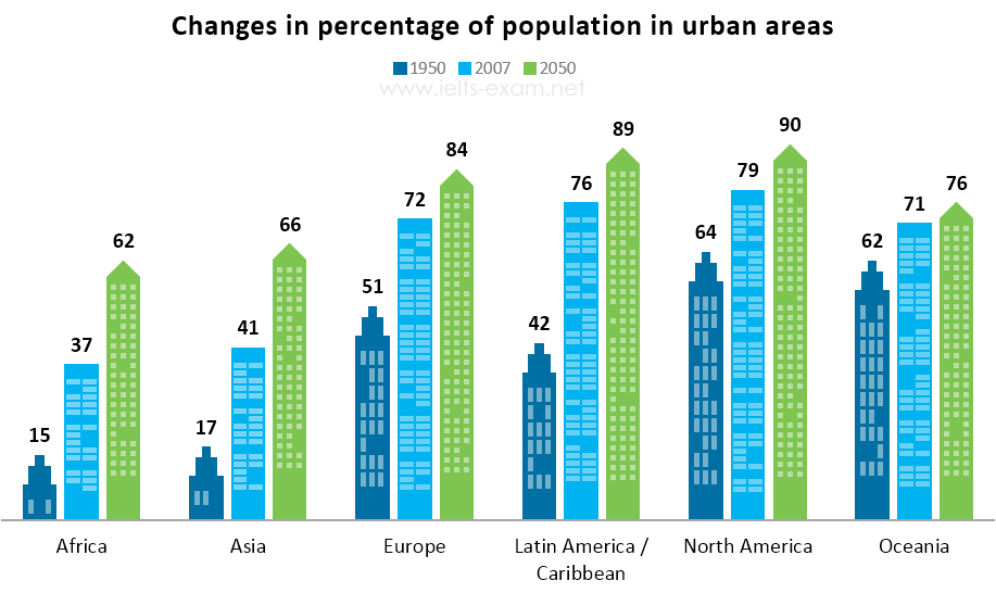
The bar chart below gives information about the percentage of the population living in urban areas in different parts of the world.
Summarise the information by selecting and reporting the main features, and make comparisons where relevant.
Write at least 150 words.

Source: United Nations
Model answer
The graph compares the growth in the percentage of the population living in urban areas in six different regions of the world.
According to the chart, between 1950 and 2007 the percentage of the population living in cities in Latin America and the Caribbean almost doubled, from 42% to 76%, whereas in Europe it only increased by 21%. However, in Europe over half the people already lived in cities in 1950.
When we compare the projected increases in Asia and Europe by 2050 we see that in Asia the percentage will continue to grow at the same speed, with a further increase of 25%, whereas in Europe the change will be slower than before, increasing by only 12%. By 2050, the vast majority (around 90%) of people in Latin America, the Caribbean and North America will live in cities. Even in Africa, more than half the population (62%) will live in urban areas by then.
(155 words)