Bar Chart

A bar chart or bar graph is a chart that uses either horizontal or vertical bars to show comparisons among categories. One axis of the chart shows the specific categories being compared, and the other axis represents a discrete value. Some bar graphs present bars clustered in groups of more than one (grouped bar graphs), and others show the bars divided into subparts to show cumulate effect (stacked bar graphs).

Sample Questions


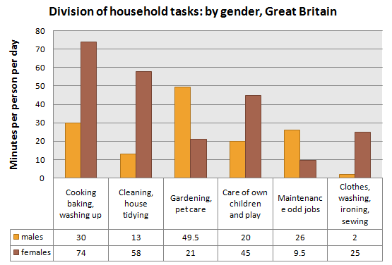
Division of household tasks: by gender, Great Britain

The chart shows the division of household tasks by gender in Great Britain.

Summarise the information by selecting and reporting the main features, and make comparisons where relevant.
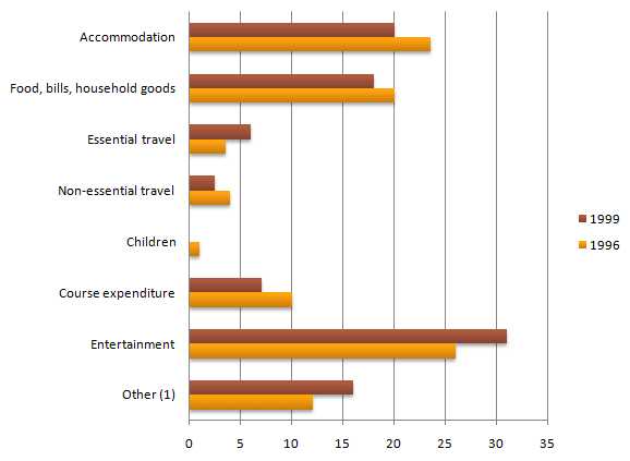
Student expenditure (aged under 26 in higher education) United Kingdom

The chart shows student expenditure over a three-year period in the United Kingdom.

Summarise the information by selecting and reporting the main features, and make comparisons where relevant.

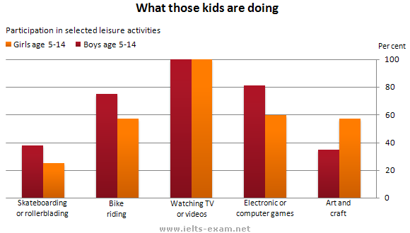
What those kids are doing?

The graph gives information about the preferred leisure activities of Australian children.

Summarise the information by selecting and reporting the main features, and make comparisons where relevant.

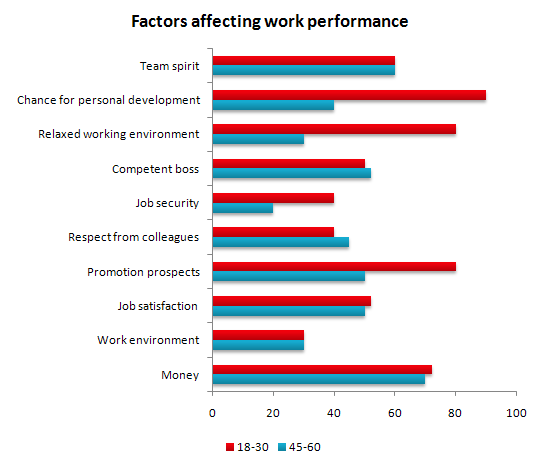
Factors affecting work performance

The bar chart shows the results of a survey conducted by a personnel department at a major company. The survey was carried out on two groups of workers: those aged from 18-30 and those aged 45-60, and shows factors affecting their work performance.

Summarise the information by selecting and reporting the main features, and make comparisons where relevant.

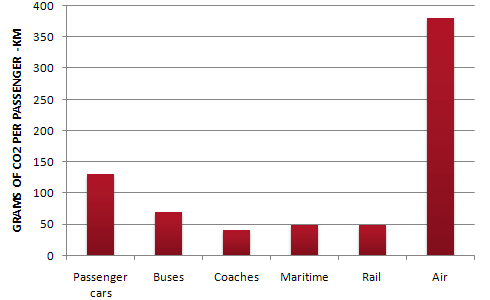
CO2 emissions for different forms of transport in the European Union

The bar chart shows CO2 emissions for different forms of transport in the European Union.

Summarise the information by selecting and reporting the main features, and make comparisons where relevant.

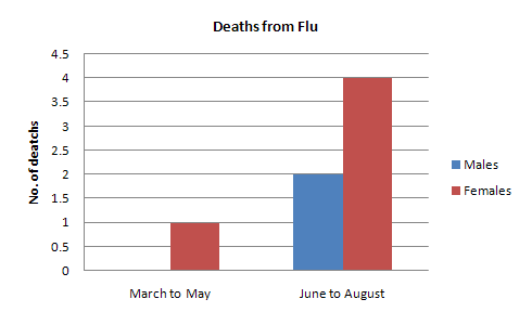
Deaths from Flu
Deaths from Flu

In June 1996, an experimental flu vaccine was trialled in a large country town on females only.

Summarise the information by selecting and reporting the main features, and make comparisons where relevant.

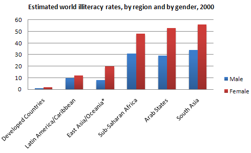
Estimated world illiteracy rates, by region and by gender, 2000

The chart shows estimated world literacy rates by region and by gender for the year 2000.

Summarise the information by selecting and reporting the main features, and make comparisons where relevant.

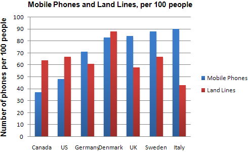
Mobile Phones and Land Lines, per 100 people

The chart shows the number of mobile phones and landlines per 100 people in selected countries.

Summarise the information by selecting and reporting the main features, and make comparisons where relevant.

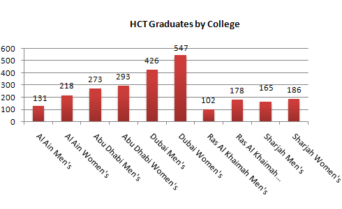
HCT Graduates by College

The graphs show enrolment in different colleges in the Higher Colleges of Technology in 1999.

Summarise the information by selecting and reporting the main features, and make comparisons where relevant.

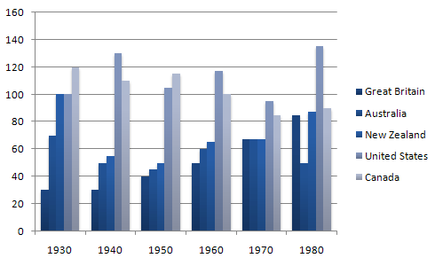
Imprisonment in five countries between 1930 and 1980

The chart shows the figures for imprisonment in five countries between 1930 and 1980.

Summarise the information by selecting and reporting the main features, and make comparisons where relevant.


Dear readers,

This is to inform you that we have moved to a new domain, https://www.ielts-writing.info/EXAM/.

Our old domain, https://www.ielts-exam.net/ will remain active till the time we migrate all our content to the new domain.

We look forward to your continuing support.